In August of 2016, the Cadillac Escala concept wowed the world with its sleek, eye-catching and downright gorgeous styling that today serves as the design inspiration for all new and future Cadillac models. But besides introducing the next iteration of the Cadillac design language, the Escala concept also had a new logo – something that has gone completely unnoticed.
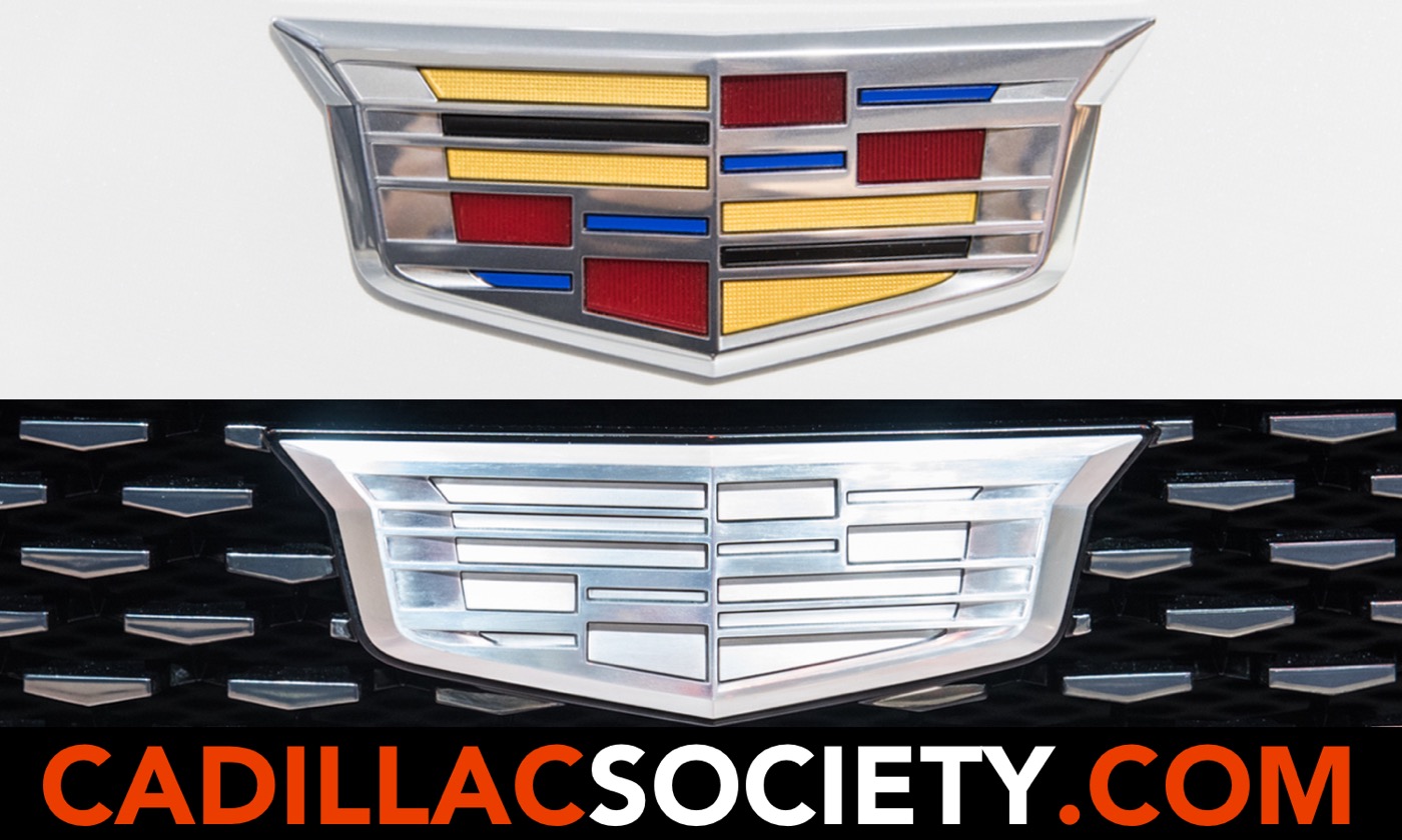
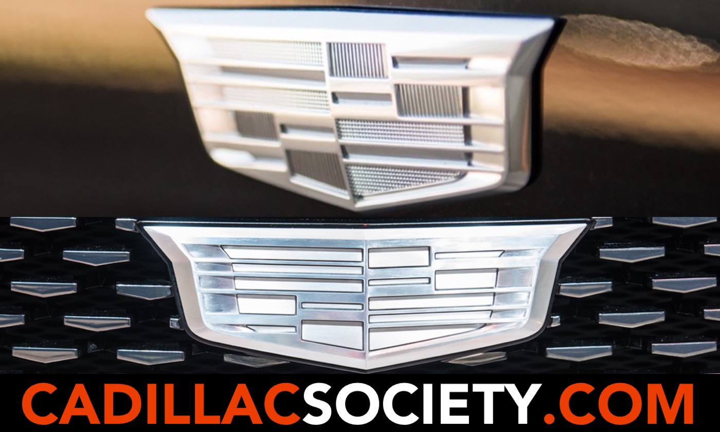
At first glance, the monochromatic logo on the Escala appears to simply be the same “crest” logo used across the Cadillac model range, but devoid of color. But a closer look reveals that Cadillac completely redesigned the crest for the Escala.
The differences between the Escala’s monochrome crest and the current “multi-colored” one – which features yellow, burgundy, blue and black accents – are all in the details:
There is also a change in texture: whereas the multi-color areas on the current crest have a grainy texture of sorts, the monochromatic version used on the Escala concept is smooth and devoid of the grainy quality.
The Cadillac logo has undergone a multitude of changes since the brand’s inception in 1902. The most recent change took place in 2014, when Cadillac did away with the laurel wreath, leaving the crest by itself, albeit in an enlarged fashion. The monochrome crest used on the Escala is used exclusively on the concept car, and has not shown up on other Cadillac models, concepts, or brand materials – at least for the time being.
However, Cadillac has been using a monochromatic version of its crest logo for a few years on the front fenders of the CT6, XT5, and – most recently – the refreshed XTS. Additionally, the upcoming XT4 will join the others in proudly sporting the silver badge on its shoulders.
However, the logo being used on the fenders of the CT6, XT5, XTS and XT4 – despite being monochromatic – is not the same emblem as the one used on the Escala Concept. Instead, it is simply a version of Cadillac’s current multi-color logo, but with the colors removed.
The introduction of the redesigned crest on the Escala concept makes us wonder whether Cadillac is planning another change to its logo in the near future, one that removes color while reconfiguring the crest’s shape and overall dimensions. Another possibility is that the Escala – being a concept car – also has an equally “conceptual” logo, and that this emblem is not intended for production vehicles.
Time will tell whether we’re on to something or not. In the meantime, share your opinion on the topic in the comments below.
Only 26 units of the 685-horsepower sedan will be built.
U.S. production of the crossover ended in January of 2025.
Getting an allocation, however, may be the tricky part.
Polos, crew necks, jackets, and more.
But the marque's EV sales increased 20 percent.
The No. 10 car was disqualified for excessive camber.