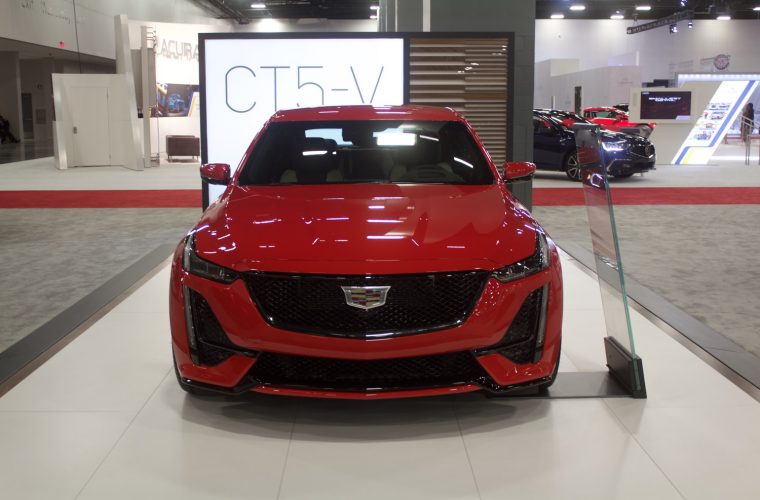
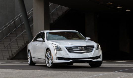
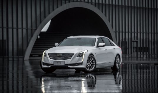
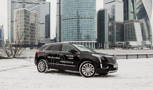
Design plays a major role in how attractive a vehicle is. Over the years, Cadillac design has tacked a number of well-executed design accomplishments to its resumé. Nevertheless, some have criticized the luxury brand’s recent direction of placing its iconic Cadillac crest on a position higher on the grille, as opposed to centering it. The exercise is most prominent on the XT6, CT5, refreshed CT6, and next-gen Escalade. To find out the reasoning behind this design direction, Cadillac Society spoke to several Cadillac designers, allowing us to bring you this exclusive report.
The designers explained that the primary reason for placing the Cadillac crest higher on the grille is all about design composition.
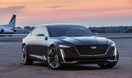
When looking at the front end of a vehicle, the observer tends to notice more prominent styling elements first, such as the headlamps, which form the “book ends” of a grille. In order to create a natural horizontal line between the headlamps, the badge is placed higher on the grille, thereby visually connecting the headlamps and creating a balanced appearance.
Conversely, placing the logo centrally on the grille would mean that it would be positioned toward the bottom end of the front end, which is lower than the aforementioned horizontal line between the headlamps. Not only would doing so remove the alignment of the logo and the headlamps, but it would also make it look like the logo is “falling”.

It really gets down to what feels right, and a logo higher on the grille feels right in terms of overall composition compared to logo placed centrally, and therefore lower, on the grille.
Granted, all that is assuming that the fascia of a vehicle incorporates headlamp housings placed higher up at the front end of the vehicle. Unsurprisingly, that characteristic is a common trait on the latest Cadillac design language, which calls for a horizontally-oriented headlamp housing (containing the primary lighting elements) followed by a vertical accent light (containing the Daytime Running Lights, turn signals and signature accents lights).

What’s more, the Cadillac design trend of placing the logo higher on the grille is also a result of progressively larger grilles, which give designers more space to work with when it comes to badge placement.
By comparison, Cadillac vehicles following the first iteration of the brand’s Art & Science design language had two distinct elements: much smaller grilles and vertically-oriented headlamps.
On those models, the Cadillac badge – at that time still encapsulated by the wreath – was centered both vertically and horizontally on the grille. Doing so allowed the logo to be aligned with the center line of the headlights, to the extent the space restrictions would allow. As such, the theory of design composition on those models is the same as on the current models, which continue to align the logo with the headlamps.
Moving forward, we anticipate Cadillac design will place even greater emphasis on the badges and their location on the vehicle, especially with a possible forthcoming light-up badging feature, as we covered previously.
Subscribe to Cadillac Society for ongoing Cadillac news coverage.


Ricky
I’ve wondered about why the logo isn’t centered myself. Good to know there is someone with an understanding for this stuff to make it look good.
Raymond Ramirez
I wonder if the two small side vents below the headlights are functional, to allow air to cool the front disk brakes and divert front air around the wheels. If the vents are not functional, then they are drag elements and don’t deserve the extra cost to design them into the fascia.
Alex Luft
They are functional. They are called air curtains and they work more to divert air up and around the wheel to decrease wheel-well air turbulence.
Betty
I actually liked the symbol “rising up” from the hood as I had with my DTS! It was a 2007. which did not have the emblem BUT I made it have one!!!
Joe B.
Move it higher and call it a hood ornament.