In August of 2016, the Cadillac Escala concept wowed the world with its sleek, eye-catching and downright gorgeous styling that today serves as the design inspiration for all new and future Cadillac models. But besides introducing the next iteration of the Cadillac design language, the Escala concept also had a new logo – something that has gone completely unnoticed.
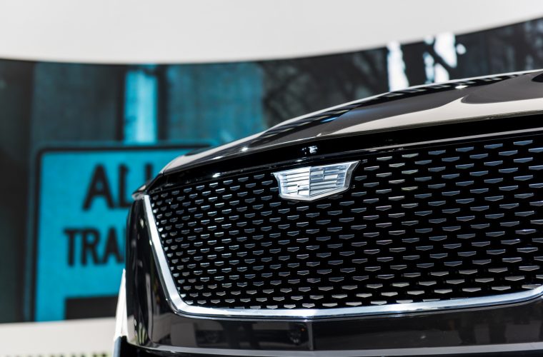
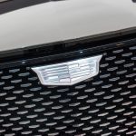
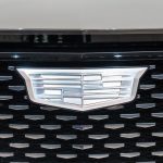
At first glance, the monochromatic logo on the Escala appears to simply be the same “crest” logo used across the Cadillac model range, but devoid of color. But a closer look reveals that Cadillac completely redesigned the crest for the Escala.
The Differences
The differences between the Escala’s monochrome crest and the current “multi-colored” one – which features yellow, burgundy, blue and black accents – are all in the details:
- The monochrome version changes the dimensions of the logo, with the logo becoming “shorter” and resulting in…
- A dimensional change of the elements inside the logo (the squares and rectangles), which become thinner and shorter
There is also a change in texture: whereas the multi-color areas on the current crest have a grainy texture of sorts, the monochromatic version used on the Escala concept is smooth and devoid of the grainy quality.
The Origins
The Cadillac logo has undergone a multitude of changes since the brand’s inception in 1902. The most recent change took place in 2014, when Cadillac did away with the laurel wreath, leaving the crest by itself, albeit in an enlarged fashion. The monochrome crest used on the Escala is used exclusively on the concept car, and has not shown up on other Cadillac models, concepts, or brand materials – at least for the time being.
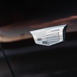
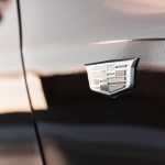
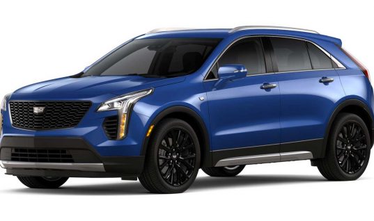
However, Cadillac has been using a monochromatic version of its crest logo for a few years on the front fenders of the CT6, XT5, and – most recently – the refreshed XTS. Additionally, the upcoming XT4 will join the others in proudly sporting the silver badge on its shoulders.
However, the logo being used on the fenders of the CT6, XT5, XTS and XT4 – despite being monochromatic – is not the same emblem as the one used on the Escala Concept. Instead, it is simply a version of Cadillac’s current multi-color logo, but with the colors removed.
The Future
The introduction of the redesigned crest on the Escala concept makes us wonder whether Cadillac is planning another change to its logo in the near future, one that removes color while reconfiguring the crest’s shape and overall dimensions. Another possibility is that the Escala – being a concept car – also has an equally “conceptual” logo, and that this emblem is not intended for production vehicles.
Time will tell whether we’re on to something or not. In the meantime, share your opinion on the topic in the comments below.



KEVIN
i hope they do change size to smaller and less colors looks like a circus logo now hate it
Alex Luft
A circus logo. Now that’s funny 🙂
What I expect is for the Escala logo – in other words, a logo that is “shorter” and without any color.
However, I expect the size of the logo to grow on the actual vehicles. After all, Cadillac is in the process of re-establishing itself in the world – a bigger logo goes a long way towards doing just that.
G. Allen Duffin
Sorry, you feel that way I believe it is the insignia of the elite, a crest of being First Class with a heritage rich in beauty, power, and luxury.
Ron Rapp
not sure if I like it or not,,would have to see it in the daylight,,,thanx
Dave G
I miss the Ducks in the logo!
Ralph L
And the tiara of pearls on top
Van Straker
They need to leave the logo alone and focus on other things. The current logo is fine, the last one was fine. How many times has BMW, Mercedes, R/R, Bentley, Porsche changed their logo..? That said I see the logo as a bit of jewelry on the car and the colors add alittle bling. Buick has recently gone back to the traditional red/white & blue on their tri-shield logo and it looks soo much better than the clear shield. Why they left the old logo on the steering wheel where the driver is constantly looking at it escapes me. I say leave the logo alone but add a layer of clear plastic to make it look like a very special piece of jewelry, its a luxury car for goodness sakes…
Gerard
Why doesn’t Cadillac build these vehicles? That’s the question. The Escala, ElmiraJ and the Ciel are all right for the times. Put a Cadillac version of the LT1 with the LT4 optional in them, and never look back.
Alex Luft
They don’t build them because they never are intended to be built in the first place.
The show cars are meant to gauge public opinion on a certain element of the concept, mostly exterior design language/direction.
Take the Escala, for example. It was the culmination of two related by distinct Cadillac concepts that preceded it, including Elmiraj and Ciel. We see major design elements from the Escala on the 2019 CT6 and XT4, and will see them in full force on the upcoming CT5, XT6, and CT4.
Now, there is going to be a vehicle that slots above the CT6 in the Cadillac lineup. We don’t know whether this model will be similar to the Escala in terms of design, but it certainly is possible.
That said, I would much rather see Cadillac make fastback-style liftback variants of the CT5 and CT6, much like Audi derives the A5 Sportback from the A4 and the A7 Sportback from the A6… instead of simply having a single dedicated fastback model (Escala) in the entire portfolio.
Alex Luft
The problem is that the Cadillac logo is just too complex in its current form.
Logo design theory tells us that a good logo must be:
1) Easily recognizable having been seen once (called recall), and
2) Easily reproducible having been seen three times, without looking at the logo during reproduction (called reproduction)
Cadillac’s current logo might pass item #1 (the recall), but miserably fails item #2 (the reproduction) due to having very intricate and complex features, which do not do it any favors in this department. As such, it is only half as effective.
Case and point: I’ve been a Cadillac owner for four years and am very detail-oriented about my car. Sadly, I would not be able to draw the current Cadillac emblem from memory even though I see it daily on my steering wheel and on the front and rear of my ATS. But despite not being a current owner of BMW, Mercedes, Audi or Lexus vehicles, I would be able to draw any one of their logos from memory. Heck, I would even be able to do so even if someone were to wake me up at 3am and ask me to draw it. This scenario demonstrates the problem with Cadillac’s emblem currently.
Migrating to the monochromatic logo will significantly reduce its complexity, and improve the logo’s recognition and recall. And personally, I think it also looks great.
Erick
You have a good point but I dont think the emblem contributes to Cadillac’s reduction of sales. If the theory were to hold true, then Porsche would not be experiencing such a high level of success as a result of its complex and dated logo. I think the major issue with Cadillac may be a combination of poor marketing, along with GM managements’ ambivalence to undergo the financially risky actions of trend setting for the luxury brand. You probably know more about this than I do though, so idk.
Van Straker
Completely agree. The Porsche logo, unchanged over the decades (like many others…) communicates legacy and heritage. The beauty of the Porsche logo is a coveted part of the car. Cadillac needs to have a leave the current logo alone except for adding the clear layer such that it also resembles a beautiful “brooch pin” on the car, or as I said above, a piece of jewelry. I also had 13 ATS 3.6 Premium which was a great car. The logo was the wreath and crest which was very attractive and it was also my first Cadillac. It was gone after one year. Constantly changing the logo does not translate to sales, leaving it alone just might?
Alex Luft
Yes, the logos of Porsche, BMW, Mercedes, or Audi have not changed much or at all over the last few decades, and for good reason: they have long been established as the upper echelon of the automotive world, and have no reason to change that. This is not the case for Cadillac.
In other words, the difference between all of those brands and Cadillac is that the German brands do not have a problem with their public image or perception. Cadillac does, as it remains a challenger brand with major public image issues. Simply put, the Cadillac brand/name does not carry the same weight, image, or status as the aforementioned brands.
Changing the product is the biggest step they can take to change that. Marketing this new product is another. And changing the logo is just as important, as it is part of the holistic approach to changing perceptions.
The product and a new logo are two parts that reflect that the Cadillac of today is “not your grandfather’s Cadillac.”
Van Straker
I disagree. Cadillac in many parts of the world, China for example, the world’s largest luxury car market, is held in high esteem and the US there remains a contingent that has high respect for the brand. You and I are examples as our ATS’s were our first Cadillacs and I’ve been driving MB for years. That said the “logo” is not going to make the difference. You didn’t buy your car for the logo, you bought a world class luxury car that had strong focused marketing behind it, which changed perceptions. Cadillac Est in 1902 has a huge pedigree and heritage to call on, longer than all the others except MB and that pedigree needs to be part of their marketing. Forgetting parts of the past is clearly necessary (Cimarron / Catera) but there is a lot of rich history and strong messages to convey. Being your Grandfathers car is a perception and that’s what marketing is for, change the perceptions not the logo. BMW, ultimate driving machine, Porsche, there is no substitute, Mercedes the best or nothing… these messages convey a perception, Cadillac, dare greatly… huh? It used to be, “an American standard of the world” and that is what is should be again. Absolutely world class, as good and better than any BMW or MB, Audi, etc… but American. Leave the logo alone…
William Jones
I have a MB SL500 and an Escalade. Give me the Escalade any day. Much nicer inside, easier to get in and out off and a better ride.
Phil Bowman
I was against the logo without the wreath when it first came out. But the shield is a new look for a company that is definitely headed in the right direction. I just wish they would build the Escala
Paul
I wish they’d put color and ducks back into the logo.
Kenton
They need to leave the logo alone! Bring back the ducks!
John Engelman
I hope not, they have changed it enough already. Have BMW, MB, and Audi ever changed their logo? NO! Forget the damn logo, just make the fu***** cars you need to be competitive in the segment and forget about the barbecue grills, fashion shows, and other trivial s***.
Cadillac needs more presence, massive advertising,and vehicles….
Alex Luft
It’s not so much about the logo as it is about the complete package.
First, the reason that BMW, Mercedes-Benz, Audi, Lexus haven’t changed their logos is that their emblems are timeless and simple to begin with. This is not the case with Cadillac’s logo, which is showing its age more than any other logo of the group. This is not a good thing… a car with a logo perceived as “old”, “outdated” or “uncool” is not desirable – putting Cadillac at a disadvantage.
But even more importantly, anyone who has studied logos, their purpose and impact will tell you that the mark of a great logo is that a person should be able to easily recognize the logo after seeing it once, and then to be able to reproduce it after seeing it three distinct times (without looking at it during the reproduction). This is where Cadillac’s current logo simply fails: all the intricate details, colors and lines are not a benefit and do not help. It’s too complex.
I’ve been a Cadillac owner for the past four years and look at the logo on my Caddy on a daily basis… clearly I can recognize it, but I sure as hell won’t be able to reproduce it even if someone paid me to. I could try, but i know I would fail. This issue is exacerbated further for average car buyers who don’t go around looking at cars, and who do not have a significant amount of intricate experience with the Cadillac brand.
By comparison, the logos of the aforementioned competitor brands are very simple. They are easily memorable, easily reproducible and as easily recognizable. In other words, they are what marketers call “sticky”. Cadillac’s current logo, albeit not ugly, is not any of those things… and it can be even more attractive by switching to the silver version used on the Escala concept, as that logo is simpler but sticker and more noticeable.
So yes, building better cars is something that Cadillac has been doing and will continue to do. But they ought to make the most of that effort by giving those cars a logo that is purposeful and effective, one that that not only looks good, but that is easily memorized as well.
Johnls_39
IMO, the logo on the Escala is purely a concept. We have to wait and see if the smoothed-out Escala derived logo will be on the upcoming patented coupe concept.
Also, Lincoln had revised their logos as well back in ’87 on the refresh Town Car (refresh back in ’85) where it was longer and sleeker looking. And also was the very last change for the automaker which carries thru out currently.
Other host of American automakers, as far I know have altered their logos over the course of the years. Some have done less so than others.
IMO, I think it is our culture in America to update the logos with a more modern look especially companies, brands and etc. No other country I know does this but I could be wrong.
Ron
I like the logo without the wreath.
I don’t like it without color.
Probably less expensive to produce in mono-color.
Ralph L
How often does anyone draw a logo? We’re not cartoonists.
I doubt any Marylander could draw his state flag, but it’s instantly recognizable because it’s totally different from everyone else’s.
Google the 1959 Cadillac crest. That mercifully didn’t last long. It’s the script that looks dated to me (and it’s a little younger than I am).
Ralph L
Make the cars distinctive, and the logo becomes unimportant. Cadillac has done this well since 1948, with a few exceptions that failed. The Escalade is the only recent successfully badge-engineered car I can think of. Even GMC has different sheetmetal now.
kv
THE WREATH and CREAST IS A BRAND STANDARD !Colors are optional,and ducks are irrelevant !The powerplant behind the LOGO is the real ISSUE here, 4.2 LTA TT V8 please !MID ENGINED ELR V !
bernard
ab0ut time- been praying this f0r years…
th0se art-dec0 c0l0rs are dated af.
next in line is BMW.
cheers fr0m germany.
ang
I dislike the new logo so much that it would hinder me from buying another Cadillac. I’m glad I bought my 2015 Cadillac when I did. The new logo looks cheap.